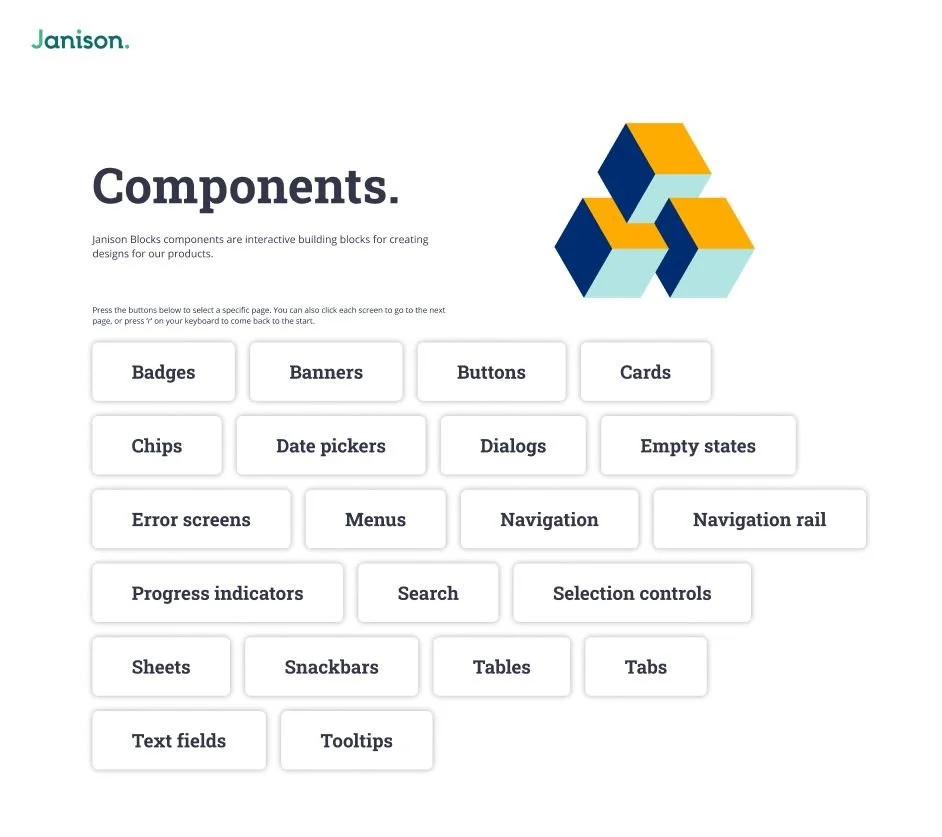
The problem: Our product team aren’t able to create and develop new designs efficiently, and our UI is not consistent or adhering to brand guidelines.
Project background.
In order to increase efficiency and consistency across all of our products, I was tasked with designing a design system in Figma, which could later be developed into a developer version. Part of the reason for creating the design system was a recent company rebrand, and a project requiring us to completely redo of one of our main platforms.
Process.
What was our process?
As we worked through creating new components for a significant project, we took the opportunity to create a design system in Figma. We created all of the components in the design system, and used instances in our projects, so that changes only had to be made in one place. This allowed us to maintain consistency. Everything used auto layouts, and we created base components for the cards with a bulk edit zone – and variant components to the side. This allowed us to be incredibly efficient with components that needed numerous variations, only needing to update the base component, while still maintaining the unique differences in each variant component.


