The problem: When candidates finish a test that is remote and offline, they are left wondering what to do next to save their answers. Users end up either feeling stressed about their responses getting lost, or walking away thinking their results have been saved when they haven’t.
Project background.
When candidates were doing a test in our Replay app, there was no communication to let them know another step needed to be taken for their responses to be submitted. In most scenarios, there were typically 1 or 2 candidates that had to get their tests abandoned. There were numerous requirements to consider:
automatic reconciliation – done after the completion of a test if the device is online at the time
manual reconciliation – requiring an invigilator to perform reconciliation manually on a device which is online
reconciliation with a file – requiring an invigilator to save the file from an offline device onto USB, then upload it onto our platform from an online device.
The solution needed to work for a wide range of use cases:
students sitting Naplan onsite
corporate staff completing qualifications remotely
Students in schools with low bandwidth in Brazil and Russia completing tests offline using our remote app.
-
• Invigilators
• Test Managers
• Students
-
Create an end of test experience that is clear and easy to use in any scenario.
Create a clear and easy to use process for invigilators to follow if they need to complete a manual reconciliation.
Come up with a solution for remote students who have dropped offline at the end of their test.
-
UX design & research
UI design
Research goals.
get a deeper understanding of the current process
understand current pain points and frustrations
identify use cases
understand technical limitations

How did I achieve the goals?
I held multiple interviews with users over Teams where I asked them a series of questions to help identify what I had outlined in the research goals.
Results were then:
documented in Figjam
findings were itemised into seperate post-its
these were clustered to identify themes
insights were drawn based on findings
recommendations were made based on the insights
Wireframes & user flows.
User flows and wireframes were done based on the recommendations.
Method & tools
The brainstorms and flows were done in Miro, based on the recommendations drawn from the interview process.
Wireframes were then sketched and done in Figma. I held meetings with stakeholders and developers along the way to get their input and keep iterating.
Usability testing.
Numerous rounds of usability testing were done, first with a low fidelity prototype, gradually building in more detail as I gathered feedback.
Method
The tests were done over Teams. I recorded the sessions and got users to share their screen and share their thoughts as they tried out the prototypes. I followed the same process of findings > insights > recommendations after each round of testing.
UI Design.
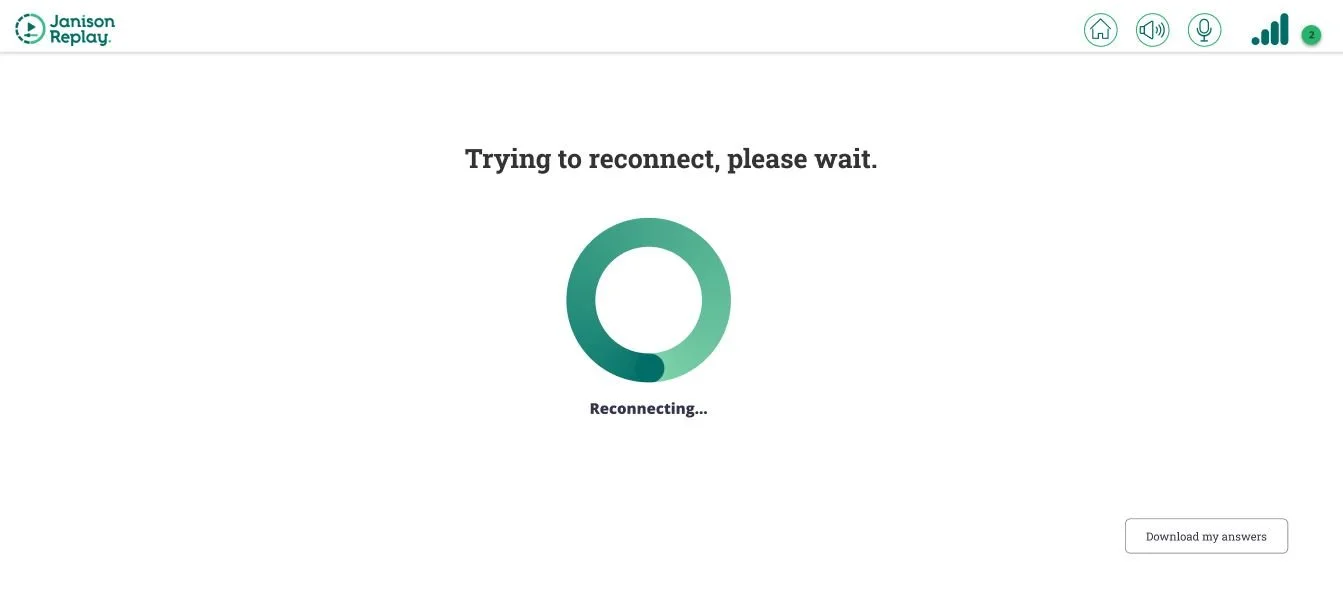
Once the users were happy with the prototype, I looked at the UI Design in more detail and focused on designing an interface that would make user’s tasks easy and efficient. The design was minimalist, with a focus on clear, concise messaging that allowed the user to take information in with ease at a time of stress. Immediate feedback was given where relevant so the user was never left wondering whether their responses had been saved, and next steps were always clearly defined.
I workshopped a solution with the development team which allowed users who had dropped offline when doing a test remotely to export their responses and email them to their test manager. Clear messaging ensured no user left their device at the end of a test without first ensuring their responses were submitted.